App UI
Animated React App UI Blocks
Product-surface blocks for the inside of your app: sortable data tables, settings pages with unsaved-change bars, notification inboxes, onboarding wizards, file managers, booking calendars, empty states, and upgrade flows. Each block is one TypeScript file styled with Tailwind, fully keyboard-operable, installable by copy-paste or CLI, and reduced to calm static states under prefers-reduced-motion.
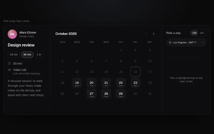
Scheduling widget in three panes: a host card with duration chips, a keyboard-navigable month grid with availability dots and direction-aware month slides, and a day's time slots that cascade in, with a 12h/24h toggle and an IANA time-zone select (plain Intl, no date library). Picking a slot splits it into Confirm, then a details form slides in, an async onBook runs, and the button morphs into a confirmation card with a drawn check and an .ics Add to calendar button.
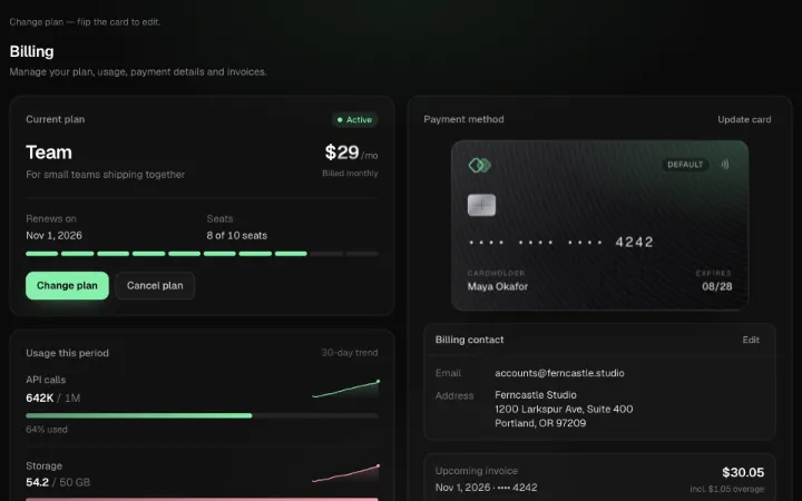
Billing settings page as one block: a plan card with a seat bar and an inline plan switcher (monthly/annual toggle, Tally-rolled prices, live proration line, async onChangePlan), a retention-flow cancel dialog (reason → discount offer → confirm), usage meters that spring to width with warn/overage states and drawn 30-day sparklines, a CSS payment card that flips in 3D to an edit form with grouped card-number entry and inline billing-contact editing, and an invoice table with expanding line items, per-row download, failed-payment retry and cascading Load more. Presentation only — use a PCI-compliant card element in production.
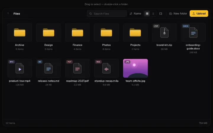
File manager pane: collapsing breadcrumb path, grid/list views that FLIP between layouts, sort menu, subtree search with highlighted matches, drag-box marquee + ⌘/Shift multi-select with a spring-up Move / Download / Delete bar, drag-to-folder moves, inline rename and New folder, a docked details pane, right-click / Shift+F10 context menu, and drop-anywhere uploads with per-file progress rings via async onUpload. Folders open with a direction-aware slide; the grid is a roving-focus role=grid.
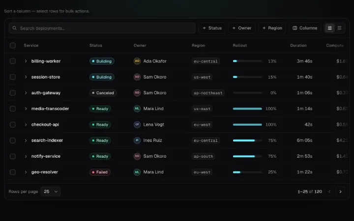
Full-featured client-side data table block on a real <table>: debounced search with highlighted matches, per-column filter checklists, column visibility and density, tri-state sorting where rows FLIP to their new positions, shift-click range selection with a spring-up bulk action bar (rolling count, confirm-to-delete), expandable detail rows, sticky header and first column, rolling pagination, an empty state, and roving arrow-key focus with aria-sort and live announcements.
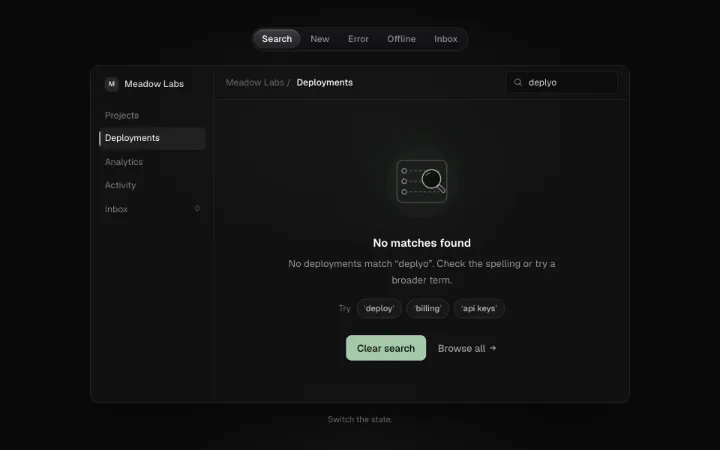
Empty-state block with five presets (no results, first run, error, offline, inbox zero) and a custom mode. Each preset has an original 1.5px line illustration with one accent detail and a three-cycle idle loop, plus title, description, primary action, secondary link, suggestion chips and an async retry button that runs pending to success.
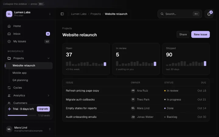
App shell block: a workspace switcher, sectioned sidebar nav with height-animated nested groups, an active pill that slides between items, Tally badges that roll on change, a pinned footer card and a user menu; the sidebar springs between full width and an icon rail (toggle or `[`) with label flyouts and nested flyout menus; the topbar carries breadcrumbs, a ⌘K manifest command palette and a tocsin notifications bell; under 720px of container width the sidebar becomes a swipe-to-close drawer with a focus trap. Controlled collapsed / activeId, skip link and a <main> landmark.
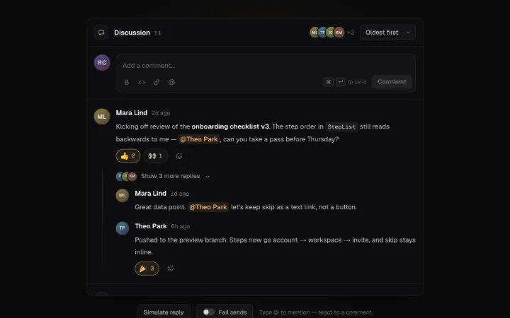
Threaded comments block for a doc, issue or PR page: an auto-growing composer with bold / code / link toolbar, caret-anchored @mention autocomplete painted as tokens right in the textarea and ⌘/Ctrl+Enter to send; optimistic posting that dims with a spinner, flashes the accent on success and offers Retry / Discard on failure; six-emoji reactions whose chips spring in and roll their counts on Tally drums (yours accent-outlined, hover lists who reacted); one-level replies that collapse to "Show N more replies"; resolvable threads that fold into a receipt line; inline edit, confirm-to-delete and copy-link actions on a roving toolbar; an "N new replies" pill for comments that arrive via ref.receive() while you're scrolled away; Oldest/Newest sort and a polite live region.
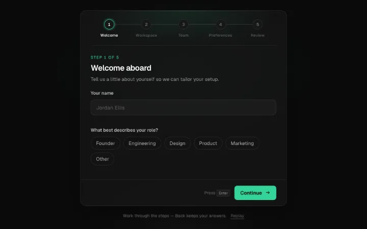
Multi-step onboarding wizard in a card: a numbered step rail whose track fills to the current step (completed nodes draw a check, reached steps stay clickable), direction-aware sliding step bodies with a springing card height, and schema-driven step kinds — name + role chips, workspace name with a live typed slug preview and async availability check, email-chip invites with a role, preference toggle cards, and a review summary with Edit jumps. Per-step validation shakes and explains, Enter advances, Back keeps answers, and Finish fires a spark burst and onComplete(values).
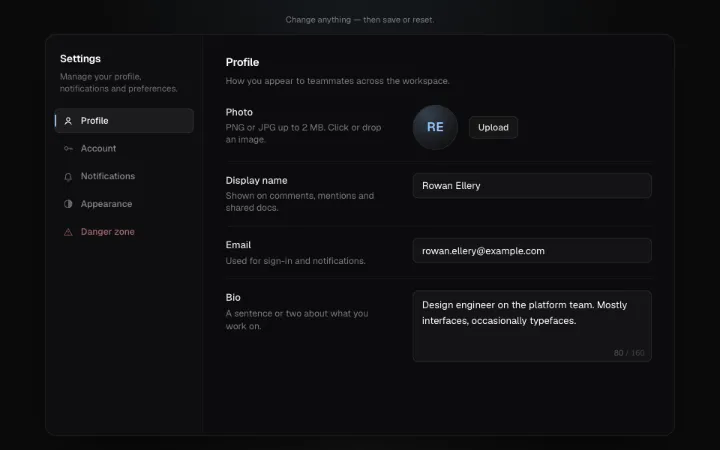
Settings page block: schema-driven sections with a sliding section nav (tabs or scroll-spy), validated inputs, a counted bio, avatar uploader, spring switches, theme radio cards and Quorum segmented controls. Any change slides up a dirty-state save bar — async onSave drives pending, error and a fading Saved chip; Reset springs every field back. Danger zone actions use Ratchet hold-to-confirm.
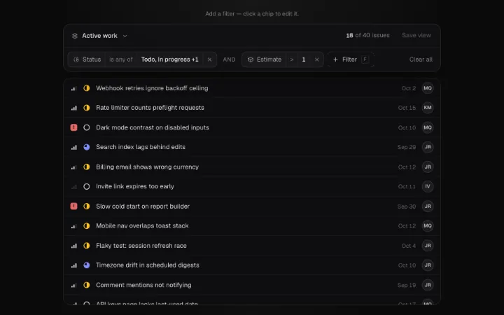
Structured filter bar for any list or table: a + Filter popover that slides property → operator → value (type-ahead fields, per-type operators, checkbox listbox, number range, and a range-selecting month calendar with presets), spring-in chips you edit in place part by part, an and/or toggle, saved views that crossfade chip sets with inline Save view, Clear all, and a result count rolling on Tally drums. Controlled or uncontrolled, keyboard-first (F, arrows, Backspace), with a pure applyFilters() helper to drive your rows.
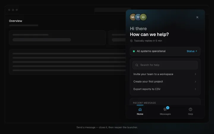
In-app support messenger block: a round launcher with a Tally unread badge that morphs (shared layout) into a 380×600 panel — a full-screen sheet on phones — with Home / Messages / Help tabs. Home has a team avatar stack, reply-time line, system-status strip, highlighted article search, recent conversation and a message CTA. Messages pushes from a thread list into a role="log" conversation with grouped bubbles, typing dots, delivered/read ticks, attachment chips, a hand-off card and a Sluice composer with optimistic send + retry. Help pushes categories → article reader with "Was this helpful?" that collapses into a thanks line. ref.receive() types then delivers, bouncing the launcher once when closed. Escape closes and restores focus; crossfades under reduced motion.

Notification center block: a bell whose unread badge rolls on Tally digit drums and swings once when something arrives, opening an anchored dialog (or inline panel) with All / Mentions / Archived tabs on Detent, sticky Today / Yesterday / Earlier groups, rich-text rows with avatars or system glyphs, inline Accept/Decline that collapse into a receipt, swipe-left or hover-button archive with a height collapse, staggered Mark all read, and push() that slides new items in with an accent flash. Roving keyboard focus with R / E shortcuts and a polite live region.
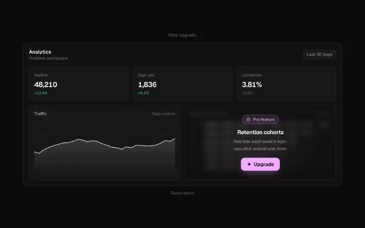
In-app upgrade / paywall block: TollgateLock dims any feature behind a frosted veil with a Pro chip that lifts on hover, and its Upgrade button morphs into a focus-trapped upgrade dialog — usage meter at its limit, monthly/annual toggle with savings badge, plan radio cards with Tally-rolled prices, a ticking unlock list and async onUpgrade that bursts Sparks into “You're on Pro” and lifts every lock under the provider. Presentation only — gate for real server-side.
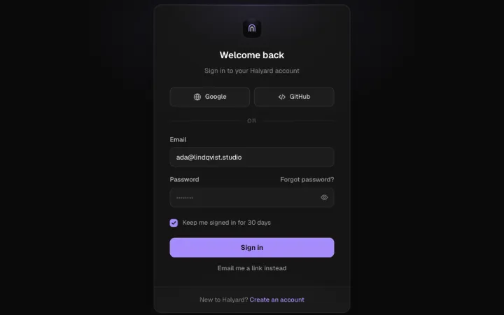
Auth card block covering every flow — sign in, sign up, magic link, OTP/2FA, forgot and reset password — morphing between steps with direction-aware slides and a spring height. SSO buttons with per-button spinners, password reveal + caps-lock warning, a 4-segment strength meter with a live rule checklist, an envelope that folds shut on 'Check your inbox' with a resend countdown, Passcode cells that auto-submit and shake on a wrong code, and async callbacks driving pending, a slide-in error banner and a drawn-check success state.