Navigation
React Navigation Components
Menus, tab bars, docks, and animated active indicators for React. Every component is a single TypeScript file styled with Tailwind, copy-paste ready or one CLI command away. They carry correct roles and full keyboard support, and settle to a static state under prefers-reduced-motion.
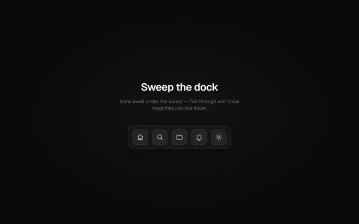
A dock whose icons magnify under the cursor with wave falloff to neighbors on spring physics — the swelling icon brightens with a soft white glow, neighbors catch a dimmer silver spill, and a soft reflection tracks the cursor across the plate. Keyboard focus magnifies like hover; coarse pointers get plain tap targets.
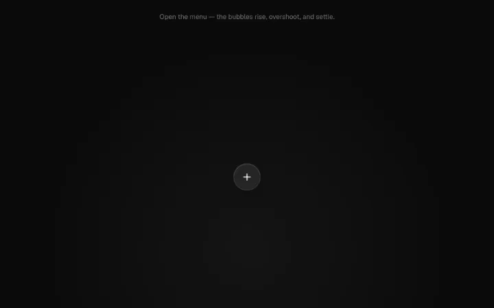
Floating action button that springs open an arc of glass bubble actions — buoyant overshoot with a bottom-up stagger, asynchronous idle bob, liquid squash on toggle, and a single coral accent on the active bubble. Full menu-button keyboard support with Escape to close.
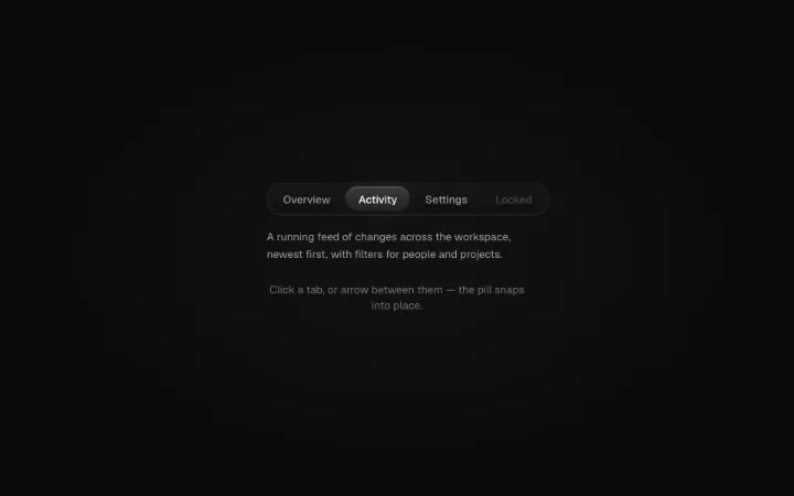
Animated tabs with a shared-layout sliding pill indicator that flashes white as it lands and rests as a neutral pill with a subtle top hairline. Full roving-tabindex keyboard support with arrow keys, Home/End, and correct tablist/tab/tabpanel roles.
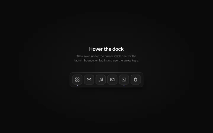
A macOS-style magnifying dock: the tile under the cursor swells to a peak scale and its neighbours follow on a Gaussian falloff, rolling a magnification wave along the row on spring physics. Its signature is the launch bounce — activating a tile fires the classic dock leap (spring up, squash on landing, settle) while an accent dot marks running tiles. Real links/buttons with labelled tooltips, a roving-tabindex toolbar (Arrow keys move, Home/End jump), and a static, tooltip-only fallback under reduced motion.
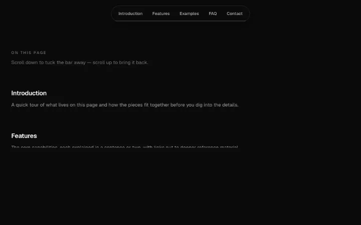
A floating pill navbar — a frosted near-black bar with a subtle white bottom hairline — that hides on scroll down and reveals on scroll up. Scroll-velocity aware, and never hides while any child has keyboard focus.
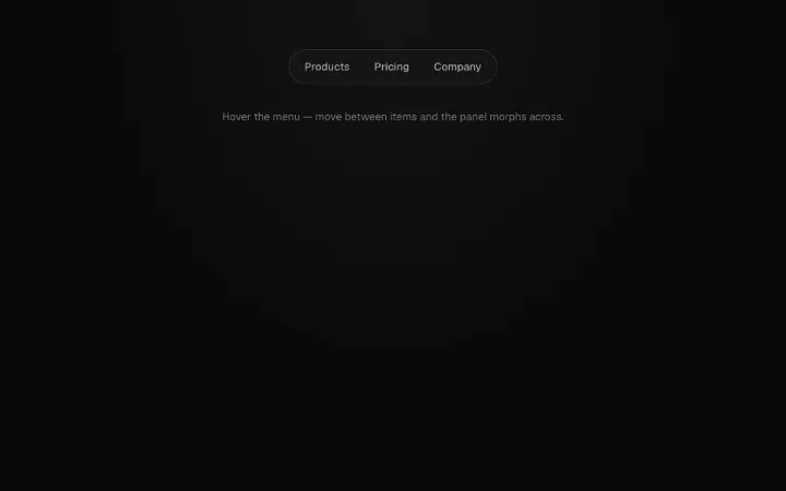
Morphing flyout nav where one shared dark-glass panel slides and resizes between triggers instead of closing and reopening — an anticipation-stretch morph with a caret that tracks the active trigger and content that crossfades in from the direction of travel. Hover-intent grace, full disclosure semantics (focus opens, Escape closes, arrow keys move triggers), and instant repositioning under reduced motion.
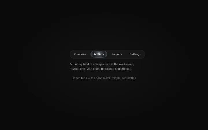
Gooey tabs whose active indicator is a bead of liquid chrome: on selection it stretches toward the target through an SVG gooey filter like mercury, the connective neck thins and breaks with silver droplets that fall and dim, then the bead settles to dark chrome with a metallic sheen and mirror-bright core. Full tablist semantics with arrow-key navigation.