Sections
Animated React Section Blocks
Drop-in hero, feature, FAQ, and pricing blocks that compose into full React pages. Each section is a single TypeScript file styled with Tailwind, ready to copy-paste or install with the CLI. They honor prefers-reduced-motion with designed static fallbacks and forward className for easy theming.
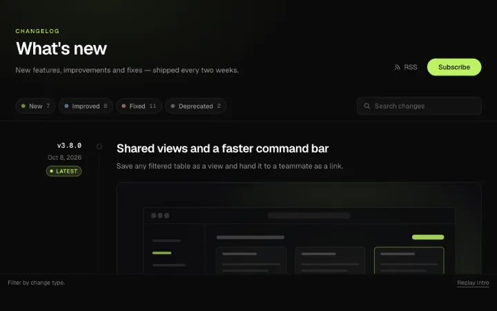
Changelog section block: release entries on a scroll-linked spine with sticky version and date, change items grouped into colored New / Improved / Fixed / Deprecated chips, procedural screenshot plates and a collapsible "Show N more changes". Multi-select kind filters collapse non-matching items with height animation, search highlights matches with <mark>, the newest release wears a single-pulse Latest badge, and a Subscribe button morphs into an inline email field with async pending/success/error states.
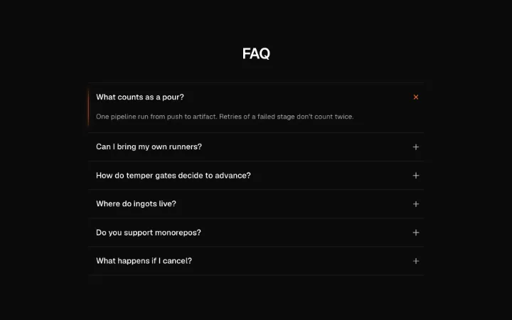
A disclosure-semantic FAQ accordion: measured height animation via motion, a hairline amber heat-line down the open item's left edge, and a plus indicator that rotates with a brief ember-glow on toggle. Arrow-key/Home/End focus movement between questions, one open at a time by default with an allowMultiple knob, instant open/close with no glow under reduced motion.
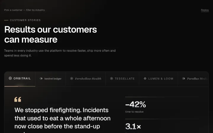
B2B customer-stories section block: a strip of original customer wordmarks acts as a tablist with a sliding accent underline and auto-advance progress line; the featured story crossfades in with a word-staggered pull quote, seeded avatar attribution and a metric rail rolling on Tally digit drums; below, an industry-filtered (Detent) story grid re-flows with layout springs, each card carrying seeded procedural cover art, cursor tilt and a hover-revealed read link.
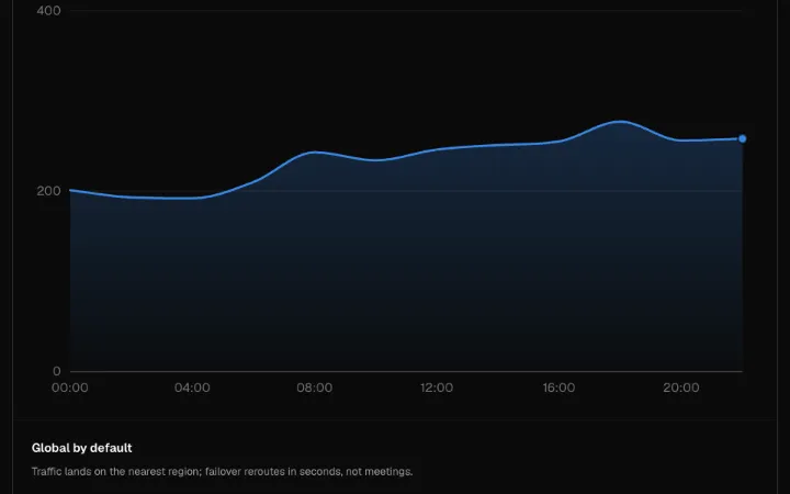
A live monitoring feature grid: a hairline-bordered 2×2 of living data vignettes — a giant odometer-rolling uptime stat, a self-drawing latency chart, a pulsing world map with landing arcs, and a scrolling activity feed — booting in a diagonal stagger from the headline stat, then settling to a low idle intensity. Composed from Tally, Plotter, Mercator, and Wire; panels accept custom children.
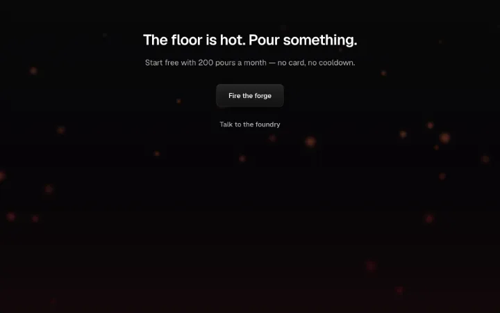
The closing call-to-action band: headline and subhead over a contained, subtle Ember rise, an Anvil-struck primary CTA beside a quiet secondary link, and a one-shot Sparks burst fired the first time the band scrolls into view (IntersectionObserver, once, skipped under reduced motion). All copy and both effects are prop-controlled.
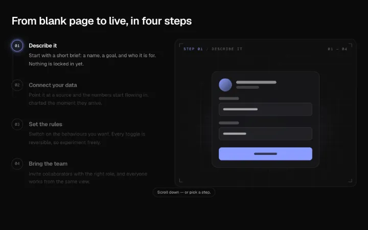
A pinned how-it-works section: scroll advances a step list while a beam draws down its rail and each step's illustration assembles on a blueprint stage — dashed wireframe boxes resolving into a filled UI vignette (form, chart, toggles, team). Steps double as a keyboard tablist that jumps the scroll.
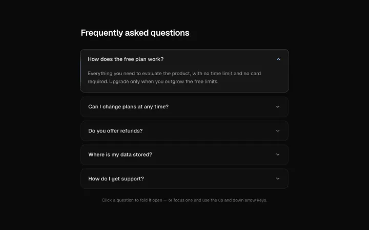
A neutral-elegant FAQ accordion of soft stacked cards: the open row lifts a hair off the stack, its chevron spins up in one accent hue, and the answer unfolds by hinging down from the top edge over a measured height animation. Full disclosure semantics with aria-expanded/aria-controls, labelled region panels, and Up/Down/Home/End focus movement; single-open by default with a singleOpen knob; instant open/close with the open row resting lifted under reduced motion.
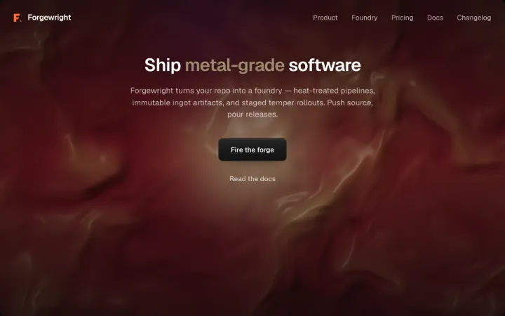
The flagship landing hero: logo + nav header, a gilded headline and subhead over the Molten shader pour, and an Anvil-struck primary CTA beside a quiet secondary link. Every content knob is a prop — the Forgewright copy is only the default — and the background node is fully swappable.
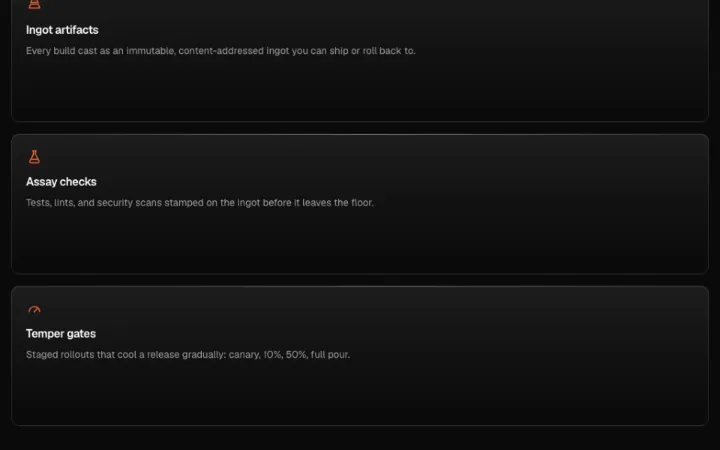
A bento features section: six feature cells with minimal forge-tool stroke icons laid out on the IngotGrid primitive with varied column spans, a Conduit beam flourish tracing push → pour in the lead cell, and staggered Surface melt reveals as cells scroll into view.
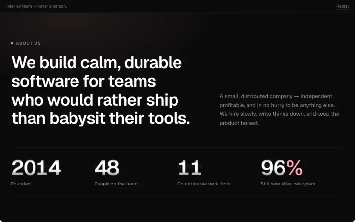
About & team section block: a mission statement with an oversized stat row rolling in on Tally digit drums, a team grid of seeded generative portraits that rest as an accent duotone and warm to full color on hover or focus with a slide-up bio panel, a Detent department filter that re-flows the grid with layout springs, and a numbered values list whose rules draw in.
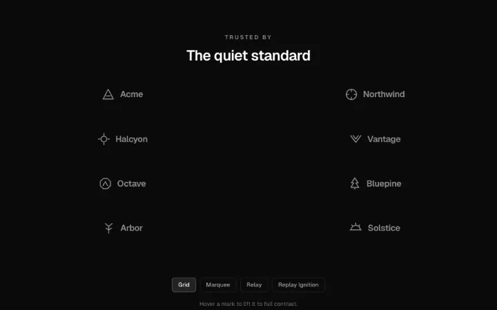
A trusted-by logo cloud section in three variants: a marquee belt composed from Frieze, a grid whose logos ignite from ghost to full contrast in a seeded stamp-landing scatter on scroll-in, and a relay row where one slot at a time plate-flips to a logo not currently shown. Marks sit grayscale and dimmed at rest, lift to full contrast on hover, and are height-normalized; eyebrow/heading framing included. Renders as a static full-contrast grid under reduced motion.
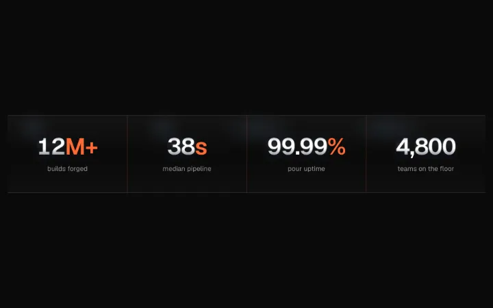
A stats band stamped like a steel plate: four big tabular numerals counting up via Tally digit drums on scroll into view, hairline amber dividers between stats, quiet labels beneath, and subtle top/bottom plate borders. Responsive 2-up to 4-up row.
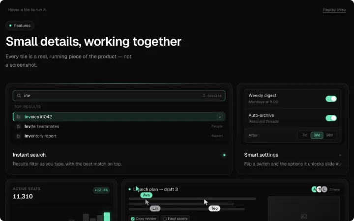
The living bento: a six-tile features grid where every tile performs a real micro-demo instead of an icon — search that types and filters, a switch that unlocks a row, a bar chart that redraws, named cursors over a mini doc, ⌘K keycaps that pop a palette, and a packet syncing two devices. A staggered idle loop keeps about two tiles performing; hover, focus or tap takes a tile over, with a cursor-follow accent border light.
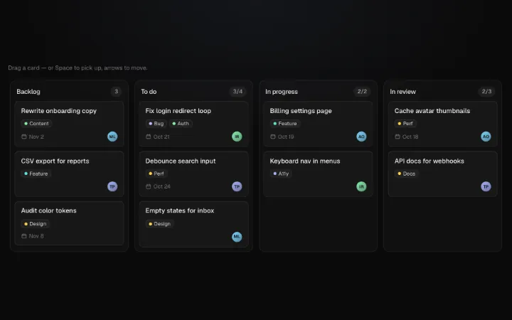
Kanban board section on plain pointer events: drag cards within and between lanes as a lifted, velocity-tilted preview while siblings re-flow FLIP-style around a placeholder, the target lane lights up, and the card springs into its slot on release. Fully keyboard operable (Space to pick up, arrows to move, Space to drop, Escape to cancel) with live-region announcements, per-lane WIP limits that turn the header amber, and controlled or uncontrolled state.
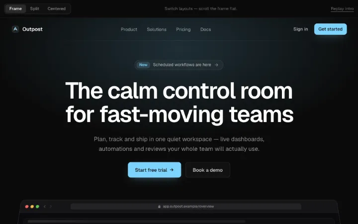
Brand-agnostic landing hero in three layouts behind one shared header (logo, nav, sign-in + CTA, focus-trapped menu sheet under 640px): frame — a product window tilted back in perspective that flattens as the hero scrolls over a pooling accent glow; split — copy beside a CSS phone whose screen push-cycles three app screens; centered — a word-by-word blur-reveal headline, announcement pill and trust row over a drifting dot grid. Staggered intro, idle loops that pause on hover, focus and offscreen.
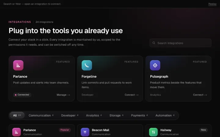
Integrations directory section block: searchable, Detent-filtered grid of seeded geometric app marks with badges and connected chips that re-flows on layout springs, a cursor-follow accent border glow, a featured hero row, and a detail sheet (side or bottom, focus-trapped) where a Conduit beam joins your app to the integration — async Connect carries light down the beam and morphs to Connected with a Disconnect ghost.
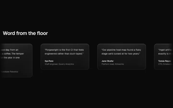
A social-proof section: testimonial quotes on quiet Kindle spotlight cards flowing through velocity-reactive Millrace marquees — two counter-flowing rows on desktop, one on mobile — slowing to a crawl on hover, with a screen-reader-only static list so each quote is heard once and a static wrapped grid under reduced motion.
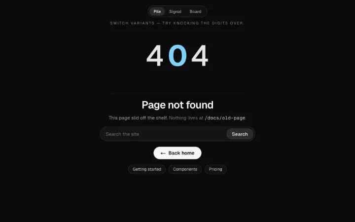
A full-width 404 section in three variants — a knock-over-able physics "404" pile (Scree), a sonar scope behind a "Signal lost" readout (Sonar), and a split-flap board that keeps trying the route and lands on NOT FOUND (Terminus). Real h1, labelled search form, home link, suggestion chips; settled frames under reduced motion.
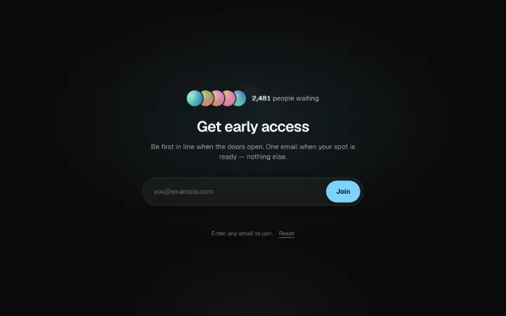
Waitlist section block: an email capsule that spring-morphs into a confirmation card with your queue number rolling on Tally digit drums, a copyable referral link, and a seeded avatar stack the joiner drops into. Async onJoin with pending/error states, shake-on-invalid validation, and a contact variant.
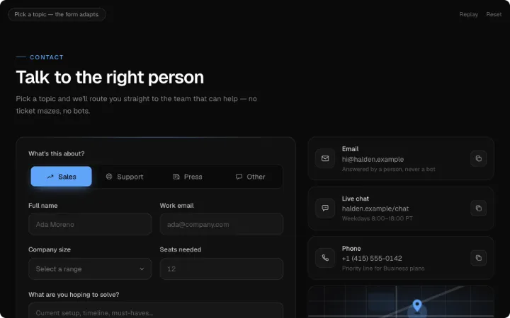
Contact section that routes before it asks: topic chips (Sales / Support / Press / Other) reshape the form with layout animation — fields glide in and out, the submit label and expected-reply line change. Blur validation with a shake, async pending → drawn-check success or an inline error that keeps every value, plus channel cards with copy-to-clipboard and an office card with an abstract SVG street plate and pulsing pin.
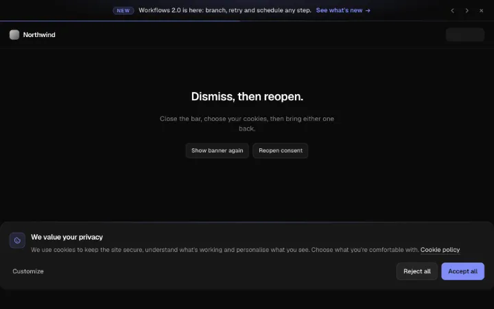
Announcement bar + cookie consent. Pennant is a slim top bar that rotates short messages with a vertical slide (paused on hover/focus, hairline progress meter), rolls an odometer countdown to a deadline and collapses on a height spring when dismissed, remembered via storageKey. Consent is a non-modal cookie card that rises into a bottom corner (full-width bar under 640px) with Accept / Reject / Customize; Customize grows the same card into per-category switches with Necessary locked on, reports onDecision, persists choices and reopens via ref from a footer link.
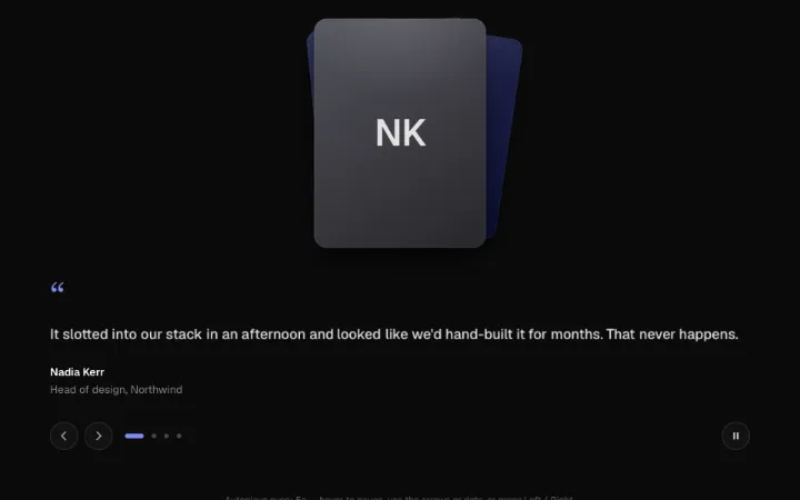
An animated testimonials rotator: a fanned stack of portraits shuffles like a hand of cards as it advances — front full-colour, the ones behind cooled to a duotone — while the quote crossfades beside it with words annealing from blur to focus. Autoplays on an interval, pausing on hover, focus, hidden tab and offscreen, with previous/next buttons, dots, a play/pause toggle, arrow-key nav and a paused-only live region. Reduced motion swaps instantly and never autoplays.
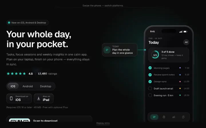
App-download section block: headline, a rating row whose stars fill in sequence while the review count rolls on Tally drums, Detent platform tabs that swap store badges and requirements, and a QR card with a seeded module grid and scan-line sweep. A CSS phone frame runs a swipeable, auto-advancing screen carousel with dot pagination and a floating callout chip tethered by a drawn leader line.
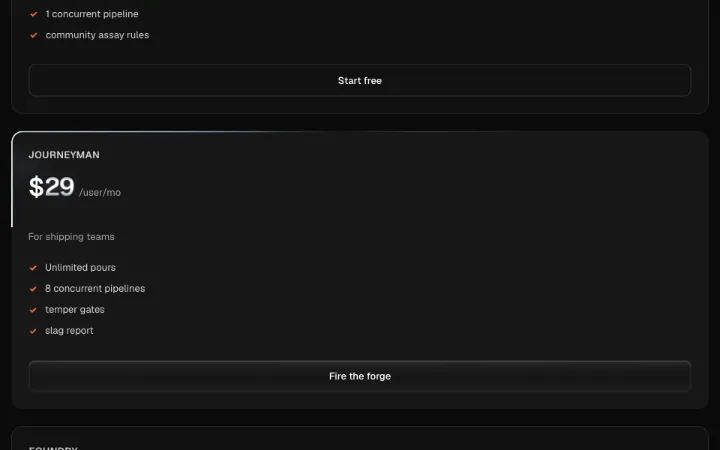
A three-tier pricing section: an accessible monthly/annual radiogroup toggle (annual = two months free) flips prices via Tally odometer drums, the featured tier is raised inside a Filament traveling-border card with a Sheen CTA, and quiet bordered cards carry the rest. Custom-priced tiers ignore the toggle. Stacks at 360px, three-up on desktop.

Big site footer: link columns that collapse to 2-up then <details> accordions via container queries, a labelled async newsletter form, social row, live status pill and legal row — signed by an oversized wordmark that rises through a clip-path curtain with a letter stagger and one sheen sweep. Compact variant drops the wordmark.
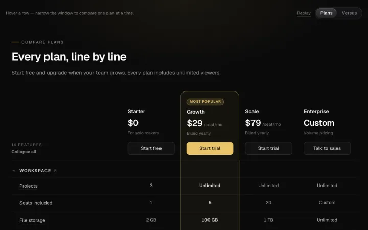
Feature comparison matrix in two modes — plans (3–4 pricing columns) or versus (your product framed in the accent against alternatives). Collapsible row groups, a sticky name/price/CTA header that frosts once pinned, checks that draw in row by row, row hover with floating hints, column-header dimming, and a one-column view with a segmented picker and swipe under 640px. Real table semantics.